
Effective Flyer Design: 5 Rules Our AI Masters for Pro Results
Crafting an effective flyer isn't just about pretty pictures; it's about strategic communication that gets results. For busy small business owners, event planners, and marketing managers, creating professional-grade flyers can feel like an uphill battle without formal design training. What makes a good flyer design? It comes down to a few core principles that separate amateur efforts from high-impact marketing materials.
This guide breaks down the five unbreakable rules behind truly effective flyer design. More importantly, we'll reveal how our AI flyer generator seamlessly integrates these principles to deliver stunning, professional flyers in seconds. You can finally stop worrying about complex software and start creating materials that grow your business. See how easy it is with our AI flyer generator.
Mastering Core Flyer Design Principles with AI
Great flyers communicate clearly and persuasively. An AI-powered flyer design generator is trained on these foundational rules, ensuring every output is built for maximum impact. Let's explore the first three critical principles.
Rule 1: Visual Hierarchy – Guiding the Eye Where It Needs to Go
Visual hierarchy is the art of arranging elements to show their order of importance. A strong hierarchy guides the reader’s eye naturally through your message, from the most important piece of information (the headline) to the least (the fine print). It’s the silent director of your flyer, telling your audience what to read first, second, and third. Without it, a flyer is just a confusing jumble of text and images.
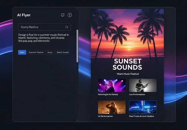
- How Our AI Masters It: When you input your text prompt, our AI immediately identifies the key components: the headline, the event details, and the call to action. It automatically assigns them prominence using size, bolding, and strategic placement, creating a clear path for the reader's eye. This ensures your main offer grabs attention instantly, ensuring your message stands out.
Rule 2: Contrast – Making Key Elements Pop and Grab Attention
Contrast is what makes a flyer visually interesting and easy to read. It’s achieved by making different elements stand out from one another. This can be done through color (a light font on a dark background), size (a massive headline above small body text), or font style (a bold, decorative font paired with a simple, clean one). Strong contrast prevents your flyer from looking flat and ensures that the most critical details are immediately visible, even from a distance.
- How Our AI Masters It: Our AI understands the power of contrast. Based on your selected color palette and style, it intelligently generates designs with high-impact variations. It ensures that your call to action doesn't blend into the background and that your headline commands attention. This automated process guarantees your flyer is not only beautiful but also highly functional as a marketing tool. Ready to design your own flyer?
Rule 3: Color Theory – Evoking Emotion and Reinforcing Your Brand
Color theory is more than just picking colors you like; it’s about using color to evoke specific emotions and reinforce your brand identity. Are you promoting a vibrant summer party or a serious corporate webinar? The colors you choose will set the tone instantly. A consistent color palette helps build brand recognition and makes your marketing materials look cohesive and professional.
- How Our AI Masters It: You don't need to be a color expert. Simply describe the mood or purpose in your prompt (e.g., "a fun, energetic flyer for a music festival" or "a professional, minimalist business flyer"). The AI will access its knowledge of color psychology to generate palettes that match your intent, creating an emotional connection with your audience and ensuring your business flyer design is perfectly on-brand.
The Unsung Heroes: Typography & Spacing for Professional Flyers
While hierarchy and color are crucial, the details of text and spacing are what truly elevate a design from good to great. These are the principles that create a polished, professional flyer design that builds trust with your audience.
Rule 4: Typography – Choosing Fonts for Impact and Readability
Typography is the style and appearance of your text. Choosing the right fonts is critical. A common mistake is using too many fonts, which creates a chaotic look. The best practice is to use two or three complementary fonts: one for headlines, one for body text, and perhaps an accent font. Good typography ensures your flyer is not just stylish but also effortless to read.
- How Our AI Masters It: Font pairing is a skill that takes designers years to perfect. Our AI does it for you in a split second. It selects and pairs fonts that are proven to work well together, matching the style you've requested—be it modern, elegant, or playful. This guarantees excellent readability and a polished, cohesive look across your entire event flyer design.
Rule 5: White Space – The Power of Less for Clarity and Focus
White space (or negative space) is the empty area around the elements on your page. It’s one of the most powerful tools in design. White space isn't wasted space; it helps your content breathe, reduces clutter, and focuses the reader's attention. A flyer packed with too much information looks overwhelming and is often ignored. Ample white space signals professionalism and confidence.
- How Our AI Masters It: Our AI is programmed to create balanced, uncluttered layouts. It strategically incorporates white space to frame your key messages, improve readability, and create a clean, professional aesthetic. It resists the urge to fill every corner, resulting in a design that feels focused, calm, and easy to digest. You can create flyer design with perfect balance every time.
Empower Your Marketing: Design Professional Flyers with AI Confidence
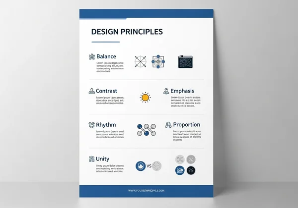
Understanding these five fundamental rules—visual hierarchy, contrast, color theory, typography, and white space—is the key to creating an effective flyer design. They are the building blocks of communication that connects with an audience and drives action.
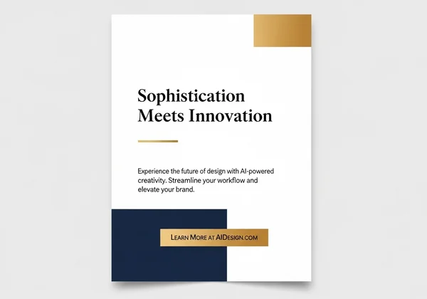
But you don't have to memorize them or spend hours in complicated software trying to apply them. Our AI platform demystifies this entire process. Our AI acts as your personal graphic designer, expertly applying these timeless principles to every flyer it generates from your simple text prompt. It makes professional flyer design accessible, fast, and incredibly affordable.
Ready to put these rules into practice effortlessly? Experience the power of AI-driven design. Generate Your First Professional Flyer with FlyerDesign.io Today!
Frequently Asked Questions About Effective Flyer Design
What truly makes a good flyer design effective?
A good flyer design is effective when it achieves its goal—whether that's to increase sales, boost event attendance, or raise awareness. This is accomplished by mastering the 5 rules: a clear visual hierarchy to guide the eye, strong contrast to make key details pop, intentional color theory to set the mood, clean typography for readability, and sufficient white space for focus.
Can I create professional flyers without any design experience?
Absolutely. This is precisely why tools like our AI design platform were created. Our ai flyer design platform handles all the complex design principles for you. You just need to provide the information and describe the style you want, and the AI will apply these rules to generate a professional-quality flyer, no experience required. It's like having a designer on call 24/7.
How does AI actually apply these design principles?
The AI is trained on thousands of examples of successful, professionally designed flyers. It learns to recognize patterns in layout, color combinations, and font pairings that work best. When you enter a prompt, it analyzes your text and goals, then applies these learned principles to structure your information in a visually effective and appealing way. You can try our free flyer maker to see it in action.
How can this platform help me instantly apply these design rules?
Our AI design tool is built to be the fastest way to apply these rules. From the moment you click "Generate," our AI instantly creates multiple design options that already have a balanced hierarchy, strong contrast, and appropriate colors. You don't have to manually adjust spacing or test font pairings. Simply choose the design you like best, knowing it was built on a foundation of expert design principles. Start designing now and see the difference.