
Flyer Readability Tips That Matter More Than Decoration.
A flyer can look energetic and polished but still fail at the job that matters most. People need to understand the offer fast. They do not reward a design for being busy. They respond when the headline, timing, and next action are easy to catch in the first few seconds.
That is why readability is usually a better starting point than visual flair. If the message is hard to scan, extra effects only hide the problem. A cleaner structure gives every other design choice more room to work.
For teams using an AI flyer generator, this matters even more. Fast generation helps only when the brief itself is focused. If a first draft feels crowded, the answer is usually not "add more style." It is "make the message easier to read."
Why Readability Breaks Before Visual Style Does.
The cost of asking a flyer to say too many things at once.
Most promotional flyers fail because they try to carry too many priorities at once. One block of text tries to sell the offer, explain the background, list every feature, add proof, and squeeze in logistics. The result is not more persuasive. It is harder to process.
That pattern shows up long before anyone notices whether the colors or typography look strong. [Digital] reminds content teams that most people scan pages rather than read them word for word, so key information has to be easy to spot. A flyer is even more demanding than a normal page because it has less space and a shorter attention window.
When someone glances at a promotion, they usually want a fast answer to a short list of questions. What is this? Who is it for? Why should I care now? What should I do next? If your flyer makes readers hunt for those answers, the design is already underperforming.
A strong first pass keeps one central promise in charge. That promise might be a sale, an event, a grand opening, a limited-time service, or a local announcement. Supporting details matter, but they should not compete with the headline for attention.
Put the Main Offer Where the Eye Lands First.
What belongs in the first scan?
Your first scan area should carry the information that helps a reader decide whether to keep looking. In most cases that means the offer, the audience, the timing, and the action. If those pieces are buried, the flyer feels harder than it should.
The easiest way to simplify this is to write a short message before you generate anything. [The CDC's ATSDR guidance] says the main message should be 1 to 3 short sentences placed at the top of a document or section so readers can find it quickly. The same guidance recommends short lists with seven or fewer items and meaningful headings that help readers move through content without friction. Those rules were written for clarity. They transfer well to flyer structure too.
In practice, that means your flyer should lead with the strongest promise first. A discount, event theme, opening date, featured service, or limited-time benefit should appear before background explanation. A flyer layout workflow works better when the core offer is already short enough to stand on its own.
Try writing your brief in this order:
What should move lower on the page?
- Main offer or event hook
- Essential timing or deadline
- One action the reader should take
- Supporting proof or detail
- Contact, location, or extra notes
Everything that does not help the first decision can move lower. That includes long descriptions, multiple side offers, repeated brand language, and decorative phrases that sound promotional but do not add meaning.
This is where many non-designers make the biggest improvement. They stop asking the flyer to explain everything. Instead, they treat the page like a filter. Its job is to earn the next step, not to carry the whole sales conversation.
Make Text Readable Against the Background.
When contrast is too weak to support quick scanning.
A flyer can also fail when the message is good but the text blends into the background. [Section508.gov] explains that normal text should reach at least a 4.5:1 contrast ratio against its background, while large text can use 3:1. You do not need to measure every draft by hand to benefit from that idea. The practical lesson is simple. If text sits on a busy image, low-contrast gradient, or overly light color, readability drops fast.
This matters when you are using textured AI backgrounds or uploading your own event photo. Faces, products, lighting effects, and patterned scenes can make a flyer feel lively. They also create noise behind the headline. If the offer is the most important part of the design, give it a calm area to live in.
A few simple fixes usually help:
- Use a solid or lightly tinted shape behind important text.
- Darken or blur the background image before placing small copy on top.
- Keep body text off the most detailed part of the image.
- Avoid stacking light text on pale photography unless the contrast is obvious.
Why fewer font treatments usually help.
Readability often improves when the design uses fewer text styles, not more. Too many font changes force the eye to re-learn the hierarchy over and over. A flyer usually needs one clear headline treatment, one supporting style, and one quiet style for secondary details. More than that can make the layout feel unstable.
The same principle applies to spacing. When blocks of text sit too close together, readers cannot tell what belongs together. White space is not empty space. It is a sorting tool.
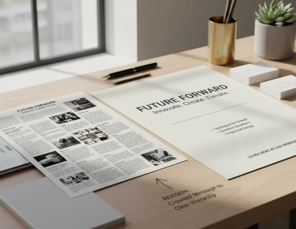
If a generated draft looks busy, resist the urge to solve it with stronger decoration. Reduce the number of competing visual signals first. Once the hierarchy is clear, a stronger look becomes much easier to add without hurting legibility.
How to Regenerate a Clearer Flyer Instead of a Busier One.
Rewrite the brief before changing the visuals.
When a first draft misses the mark, the best revision often happens in the brief. Before you change colors, effects, or image style, rewrite the request so the tool has a clearer priority to follow.
A better prompt usually includes five ingredients: the audience, the main offer, the deadline, the desired tone, and the single action. That is enough structure to guide the design without stuffing the layout with extra demands. The site's text-to-flyer tool is built around this input-first workflow, so a cleaner brief usually produces a cleaner result.
Here is the mindset shift that helps most. Do not ask the tool for a bold, exciting, detailed flyer with everything included. Ask for a flyer that makes one message obvious. Style can support that goal, but it should not replace it.
Use uploads and flyer type choices with readability in mind.
If you upload a real photo, choose one that gives text room to breathe. A product image with clear negative space works better than a crowded collage. An event photo with one subject is easier to use than a wide shot full of small details.
Flyer type and aspect ratio choices matter for readability too. A local poster-style layout can support more information because readers may stand in front of it longer. A social-sharing format often needs a shorter headline and fewer details because it competes with a fast-moving feed.
The safest workflow is to generate a simple version first, then add visual personality only after the message reads clearly. That keeps the platform in its strongest role. It helps you reach a workable promotional draft quickly, but it does not guarantee final print production or campaign performance.
Key Takeaways and Next Steps.
Readable flyers earn attention because they remove friction from the first decision. The fastest way to improve one is to reduce competing messages, place the main offer first, and protect text from weak contrast or noisy backgrounds.
If your current draft feels flat, do not assume it needs more design. It may just need less clutter. Tighten the message, simplify the hierarchy, and generate a cleaner second pass. Once the structure works, visual style has something solid to build on.